Color Grading for Brand Consistency Across Campaigns
How we build and reuse LUTs so every deliverable — reel, ad, or event highlight — feels unmistakably on-brand.
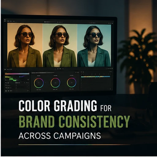
A brand that looks different in every video it puts out has a colour grading problem, even if nobody on the marketing team would describe it that way. Consistency is what makes a scroll-stopping reel and a six-month-old brand film feel like they came from the same place.
We start every new client relationship by building a base LUT from their existing brand assets — logo colours, packaging, past campaign stills — rather than starting from a generic cinematic preset. That base grade becomes the anchor every future deliverable is checked against, whether it is shot on a cinema camera in-studio or a phone at a live event.
The discipline is in adapting that anchor grade to wildly different lighting conditions without losing it. Footage from an outdoor event at golden hour and footage from a controlled studio product shoot should never be graded identically, but they should still read as the same brand when placed side by side on a feed.
We keep a shared reference board per client — skin tones, key brand colours, and a handful of approved "problem" shots (mixed lighting, neon signage, low light) with their correct grade already solved. New editors on a project inherit that reference instead of re-solving the same colour problems from scratch on every job.
The payoff shows up over months, not on a single deliverable: a client whose Instagram grid, YouTube pre-rolls, and event highlight reels all look like one continuous visual identity, rather than a patchwork of whoever happened to edit that particular video.